An Approach to Designing Furniture
Over many years as a design engineer, I've learned some valuable
lessons about design:
- Paper is cheap! So are pencils and
erasers!
There is nothing wrong with false starts! Sometimes your
initial direction
is simply wrong, and just figuring out what it is wrong is a
critical aspect of good design. I find it strangely
satisfying when I finally
admit to myself that the direction I took was wrong, and it is
OK to
just tear up the paper and start over again!
- Focus on the "what" not the "how." Don't start
a new design by fussing over joinery. Design details
like joinery are critical to a successful design, but that
level of detail must wait until you've settled on exactly
"what" it is your designing.
- The least expensive place in any project to remove errors
is while the project is
still on the drawing board! It's really important
to work out any joinery or construction issues after you've
clearly defined the "what" and turn your attention to the
"how".
- Something complex, like a chair, demands a prototype.
Even if you've done everything right, you're bound to run into
construction issues. The worst place to try to solve
these is while you're attempting to build the actual
piece. A prototype also confirms that the form you've
chosen actually works. Chairs can be very difficult to
design because of the numerous variables that distinguish one
chair from another. The only way to be sure is to build
a prototype and try sitting in it! Sometimes you might
think you've nailed the form for a cabinet, but once the
actual form emerges, it doesn't work. The only way to be
sure is to prototype it first.
- Modeling can help. Certain forms are difficult
to imagine as a three dimensional object looking at a two
dimensional drawing. A simple 1/4 scale model can go a
long way towards confirming your idea. The model does
not have to be complex or detailed, and can even be made from
Styrofoam or cardboard.
- Good design takes time, but good design also reduces
construction time! Slow down! Enjoy the
process. Determine to do your best work, and remember,
once you complete a project, whether you love the end result
or not, it's finished and your stuck with it for better or for
worse!
With these lessons in
mind, I force myself to slow down, and to become
immersed in the design process. In my professional life I’m
a
computer expert and have designed and written complex software
over my entire career. Strangely, in my woodworking life, I
prefer to avoid using computer aided design software.
I
find I simply
spend too much time trying to make the software do exactly what
I want
it to do, time and energy that subtracts from my overall
attention to
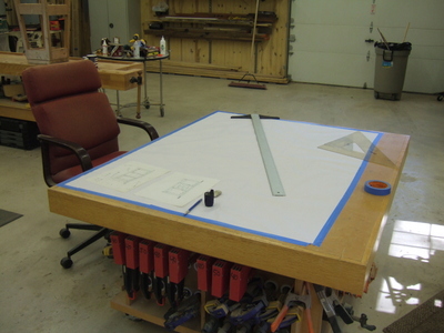
the thing I’m actually designing! So I put on some
soft classical
music, carefully tape a very large piece of velum on the top of my
assembly table, get out my old fashioned drafting square, my
triangles,
my lead holder, my lead sharpener, and my electric eraser, and I
immerse my mind in the design process.
I should point out that I consider the drawing phase the
culmination of the design process, not
the beginning of it! The goal of the drawing phase is to
clearly
and meticulously articulate the design ideas that I’ve already
spent a
considerable amount of time contemplating. For this
entertainment
center, I started thinking about the form at least two years
before. I’ve looked at hundreds of examples of entertainment
centers, some I liked, and some I didn't. There is
great
value in each; knowing what you dislike is often more
important
than knowing what you like.

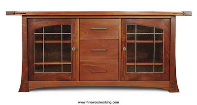
After much research I
selected an entertainment center built by
Andrew
Drake that I
found on the
Fine Woodworking
web site. To me, it was a fine example of the form that I
found
most pleasing to my
eye. This would be where I would begin, and this form will
be
what I'll incrementally change (but not necessarily improve) to
make it
my
own design. The first step is to overlay the photograph with
tracing paper and draw the image on the tracing paper. Next,
based on whatever dimensions I have about the piece, I use a ruler
to
estimate the dimensions of the piece in the photograph.
If you think this is copying, consider this: It's impossible
for one human to imagine an original form
that some other human, someplace at some time in the past, has
not already conceived of!
Understanding
this basic principle of design, regardless of the discipline, is
critical to anyone’s success as a designer.
Simply put, originality in design is exceedingly rare, and not
always a good thing! For example, if I was obsessed with
being completely original, I abandon the traditional
rectangular shape and choose instead a triangle as the basic form
for my
entertainment center. That would probably mean that I'm the
first person to ever design a triangular entertainment
center! It would be original, to be sure, but it would
also violate the most basic design principle of all that “
form should follow
function!” Engineers often think of it this
way:
To steal ideas from one person is plagiarism, but
to steal from many is research!
Good designers accept that idea and move past it. They
realize
that true genius comes out of recognizing the great ideas of those
who
have come before you. It is by making incremental changes to
what
you've learned that makes the piece uniquely yours. The
genius
part
comes into play when your changes result in something that you and
others find pleasing. This leads to another critical
success factor that is often overlooked:
you must really love the thing you’re
about to build!
Life is too short to waste precious time in the shop building
something
you really don’t like! Doing so is essentially what some
dictionaries defines as work - an unpleasant task! So for
me, the
drawing process really is the end of the design phase and the
beginning
of what I hope will be a pleasant and memorable journey into that
part
of my mind and psyche that most defines me as “me!” It is an
intensely personal and completely solitary pursuit, and is one of
those
activities that sets us humans apart as a species!
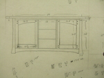
Having
said all that, let me explain the last couple of steps I took to
arrive
at the point where I’m ready to create my drawing. Since
I’ve
started out with a picture of an entertainment center I would like
to
use as a basis for my design, and I’ve estimated the basic
dimensions
of the piece, now is the time to make changes to the basic form to
incorporate my own design ideas. I do this by overlaying
tracing
paper on top of the first tracing and make my own changes to the
form
ending up with something like what is shown on the left.
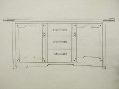
Compared to Andrew Drake's design, I've made quite a few changes,
but
I've kept his original form by keeping the ratio of width to
height the
same. I've also kept the proportions of the center drawers
to the outside doors. I’ve added elements to the original
design that I think
make it more representative of the “Greene and Greene” furniture
style. These include the “cloud lifts” on the bottom rail
and the
door, the ebony plugs, and a very subtle detail near the bottom of
each
leg. I fool around making various versions of this drawing
until
I think I have enough to take it to the drawing board.
At this point I had created a somewhat firm concept drawing
showing details that personalized
my design, but that were not necessarily "cast in concrete"
yet!
In fact, my final design and what I ultimately built ended up
being
similar but yet, different. For example, notice the cloud
lifts
on the door rails in the concept sketch and how the bottom rail
and top
rail both go up. This was a bad idea that I later
changed.
Also notice the drawer pulls and door pulls in the original
sketch. Compare that to the design I ultimately settled
on.
A lot has changed! Those changes were driven by the

pattern I
selected for the stained glass in the doors! Like the
cabinet
itself, I was also thinking about how the stained glass would
compliment the cabinet, or perhaps better stated, how the cabinet
would
compliment the stained glass. It turned out that the stained
glass would exert considerable influence over the cabinet, and I
actually was surprised by this outcome! I wanted diamonds in
the
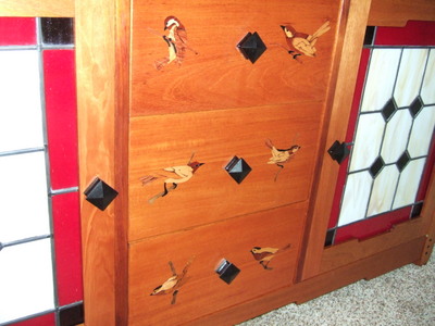
stained glass. Those diamonds in the glass suggested that
perhaps I should use
diamond shaped door and drawer pulls. From that, two other
design
ideas emerged: since I chose black for the diamonds in the
glass,
it made sense to make the pulls out of ebony. Second, I
realized
I could also reflect a "diamond" pattern made by the pulls
themselves
by arranging the door pulls horizontally with the center drawer
pull. Finally, I made no attempt at this stage to place any
detail about the marquetry images I intended to incorporate into
the
drawer faces. I only knew that I wanted marquetry images on
the
drawer fronts and quickly realized that small, diamond drawer
pulls
would leave plenty of room for marquetry on each drawer.
So a lot had changed from the original photo of Drake's cabinet
that
inspired me to create a similar cabinet of my own. I want to
point out that much of what changed had everything to do with
"design"
and nothing to do with "drafting" or creating the final
drawing.
As I said earlier, the drawing or drafting phase of the project is
the
culmination of the design phase, not the beginning of it! It
took
me a long time to realize this simple concept because I was always
too
anxious to get to the drafting phase and start working out all the
joinery and construction details. Doing this too soon is
almost
always a serious mistake, regardless of if you're designing a
cabinet
or a new passenger jet!
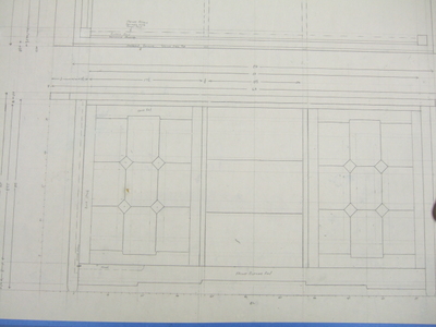
If
possible, I like to do my drawings full scale. In this case,
because the piece is too large, I had to choose a scale to shrink
it
down to a size that would fit on my drawing paper, so I chose half
scale. Notice that I included the stained glass in the
doors.
At this point, I knew nothing about making stained glass windows
and
really had no idea how I’ll pull this part of the project
off! As
a designer, it's so critical that you have the self-confidence to
not let
not knowing how to do something stop you from boldly including
that thing in your design! Whenever this has happened to me
during my professional career, I remember a simple adage that I
can also apply
to this: "Human beings make stained glass. I'm a human
being, therefore I can make stained glass too!" The fact
that at the time I'm designing this piece,
I have no idea how to do stained glass, is quite irrelevant!
I can learn how to make stained glass just as I've learned how to
make the mortise and tenon joints!
So now that I’ve completed my design, it’s time to create my
materials
list and start the rather unpleasant process of actually obtaining
the
materials I’ll need to build this piece.
I hope this little monolog on design encourages you to try this
for
yourself. Take your time, be patient with yourself, welcome
your
mistakes and see them as opportunities to improve! Most
importantly, slow down and spend ample time designing. After
all,
there's no limit to how many changes you can make during the
design
phase. But once it built, it's built, and your stuck with it
for better or worse!
To conclude, here is a side-by-side comparison of Drake's design
that inspired me and what I ultimately built:

 With these lessons in
mind, I force myself to slow down, and to become
immersed in the design process. In my professional life I’m
a
computer expert and have designed and written complex software
over my entire career. Strangely, in my woodworking life, I
prefer to avoid using computer aided design software. I
find I simply
spend too much time trying to make the software do exactly what
I want
it to do, time and energy that subtracts from my overall
attention to
the thing I’m actually designing! So I put on some
soft classical
music, carefully tape a very large piece of velum on the top of my
assembly table, get out my old fashioned drafting square, my
triangles,
my lead holder, my lead sharpener, and my electric eraser, and I
immerse my mind in the design process.
 After much research I
selected an entertainment center built by Andrew
Drake that I
 found on the Fine Woodworking
web site. To me, it was a fine example of the form that I
found
most pleasing to my
eye. This would be where I would begin, and this form will
be
what I'll incrementally change (but not necessarily improve) to
make it
my
own design. The first step is to overlay the photograph with
tracing paper and draw the image on the tracing paper. Next,
based on whatever dimensions I have about the piece, I use a ruler
to
estimate the dimensions of the piece in the photograph.
 Having
said all that, let me explain the last couple of steps I took to
arrive
at the point where I’m ready to create my drawing. Since
I’ve
started out with a picture of an entertainment center I would like
to
use as a basis for my design, and I’ve estimated the basic
dimensions
of the piece, now is the time to make changes to the basic form to
incorporate my own design ideas. I do this by overlaying
tracing
paper on top of the first tracing and make my own changes to the
form
ending up with something like what is shown on the left.
 If
possible, I like to do my drawings full scale. In this case,
because the piece is too large, I had to choose a scale to shrink
it
down to a size that would fit on my drawing paper, so I chose half
scale. Notice that I included the stained glass in the
doors.
At this point, I knew nothing about making stained glass windows
and
really had no idea how I’ll pull this part of the project
off! As
a designer, it's so critical that you have the self-confidence to
not let
not knowing how to do something stop you from boldly including
that thing in your design! Whenever this has happened to me
during my professional career, I remember a simple adage that I
can also apply
to this: "Human beings make stained glass. I'm a human
being, therefore I can make stained glass too!" The fact
that at the time I'm designing this piece,
I have no idea how to do stained glass, is quite irrelevant!
I can learn how to make stained glass just as I've learned how to
make the mortise and tenon joints!